Necessary
Always activeSupports security, form reliability and remembering your privacy choice. It is not used for advertising.

A beautiful website earns attention, but reliable interactions, clear decisions, and credible evidence are what build trust and support conversion.
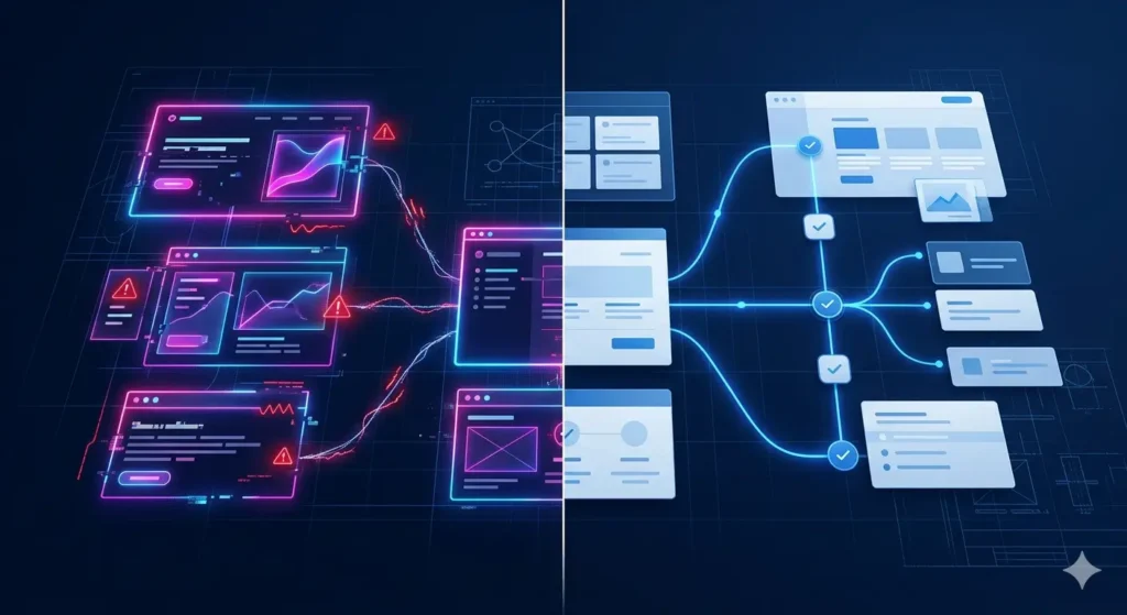
website trust design begins with what visitors can understand, predict, and complete—not with how polished the interface appears. Strong typography and motion may create a positive first impression, but that impression weakens when navigation is ambiguous, proof is missing, or a form gives no response. For founders and marketing leaders, the practical question is whether the website reduces uncertainty at each decision point. A credible experience connects message, evidence, interaction, and follow-up into one dependable journey.
Visitors rarely separate design, content, and technology. They experience one system. If a premium-looking page loads inconsistently, sends them through an unclear route, or hides essential conditions, the visual layer cannot compensate. These are conversion trust factors because they influence whether someone feels safe enough to continue, share details, or request help.
Trust also depends on evidence appearing near the claim it supports. A service promise without process detail, relevant work, or a clear next step creates avoidable doubt. Mono’s guidance on service page trust signals explains why proof works best where hesitation occurs. Readers can also review completed digital systems to understand how capabilities translate into operational outcomes.

Confidence grows when the system behaves as the interface promises. Buttons should lead somewhere expected. Forms should validate input clearly, confirm submission, and explain what happens next. Navigation labels should match the language buyers use. This is the functional core of website UX trust: users receive timely, consistent feedback instead of having to guess whether an action worked.
Performance belongs in the same discussion. The official Web Vitals guidance frames loading, interactivity, and visual stability as distinct aspects of user experience. Metrics alone do not prove trust or conversion, but they help teams identify friction that observation may miss. Technical evidence should therefore be reviewed alongside journey behaviour, form completion, and qualitative feedback.
A reliable website trust design system connects these signals to a deliberate website conversion system. Rather than treating copy, CTAs, forms, analytics, and response handling as separate improvements, it aligns them around the visitor’s decision. That architecture makes failure easier to locate and improvement easier to verify.

The highest-risk moments usually appear after initial interest: comparing a service, choosing an option, submitting an inquiry, or waiting for confirmation. Strong website conversion trust requires every step to answer three questions: What am I doing? What information is required? What will happen after I continue?
This is why form usability is a business concern, not a minor interface detail. Unclear labels, unnecessary fields, silent errors, and missing success messages introduce hesitation at the exact point a visitor is ready to act. Effective interaction feedback removes that ambiguity without adding promotional language. It confirms state, explains errors, and sets a realistic expectation for response.
Teams planning a new build can define these behaviours early with a website requirements checklist. Existing sites may need targeted website repair and optimization instead of a complete redesign. The right choice depends on whether the constraint sits in messaging, structure, code, integrations, measurement, or several layers together.

Start with representative high-value journeys rather than a subjective review of individual screens. Test them on real devices, with realistic input, and through the complete handoff. Record where a visitor must pause, interpret, repeat, or recover. Those observations reveal why a visually successful page can still underperform.
Prioritization should combine impact, confidence, and implementation risk. Fix broken submissions and misleading states before adjusting decorative details. After each change, repeat the same journey and compare the evidence. This creates a practical improvement loop instead of a redesign driven by preference.
A Mono System Review can help identify the smallest useful next step, while conversion-focused web development is relevant when the underlying structure needs a controlled rebuild. The broader Mono Insights library provides additional guidance across websites, SEO, automation, and growth, and the Mono Digital approach explains how those layers support one customer journey.
Beautiful design remains valuable: it directs attention, clarifies hierarchy, and expresses brand character. It simply cannot carry the full burden of confidence. Effective website trust design makes the promise visible and the system dependable. When content answers the right questions, interactions behave predictably, evidence appears at the decision point, and follow-up is clear, the website gives qualified visitors a rational reason to continue.
Review the complete decision journey, identify the constraint, and choose the smallest useful change before committing to a redesign.
Start a System ReviewSee Web DevelopmentArticle FAQ
Visual quality can attract attention, but conversion also depends on clear messaging, relevant proof, predictable interactions, usable forms, and a dependable response path. Failure in any of those layers can create hesitation.
Clear page purpose, specific evidence, understandable navigation, responsive controls, transparent forms, confirmation messages, consistent performance, and realistic next-step expectations all help reduce uncertainty.
Test representative high-value journeys from entry page through inquiry or transaction. Record unclear choices, delays, errors, missing proof, failed handoffs, and device-specific behaviour, then prioritize issues by their effect on important actions.
No. The cause may be isolated to content, forms, feedback states, performance, tracking, or an integration. Diagnose the constraint first and preserve useful content and functionality when targeted repair is sufficient.
Loading, responsiveness, and visual stability affect whether interactions feel dependable. Performance metrics can reveal friction, but they should be interpreted alongside journey completion, form behaviour, and qualitative evidence rather than treated as conversion guarantees.