Necessary
Always activeSupports security, form reliability and remembering your privacy choice. It is not used for advertising.

Small UX improvements can remove decision friction, strengthen trust, and turn an existing website into a clearer path from visit to qualified inquiry.
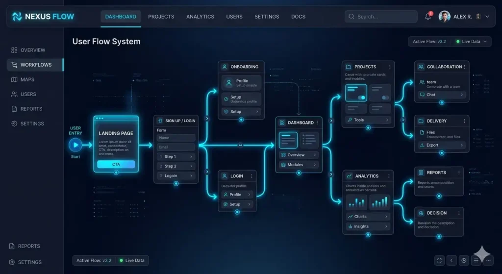
Small interface decisions often determine whether a visitor understands an offer or leaves uncertain. The most useful conversion optimization tips do not begin with decoration; they begin by removing obstacles between intent and action. For a service business, that means making the next step obvious, keeping the journey credible, and ensuring every page supports a real inquiry.
Website conversion problems are usually distributed across the journey rather than caused by one dramatic flaw. A vague headline creates doubt, competing buttons divide attention, a slow page interrupts momentum, and an unclear form makes the commitment feel larger than expected. Review the path from landing page to confirmation as one connected system, not as isolated screens.
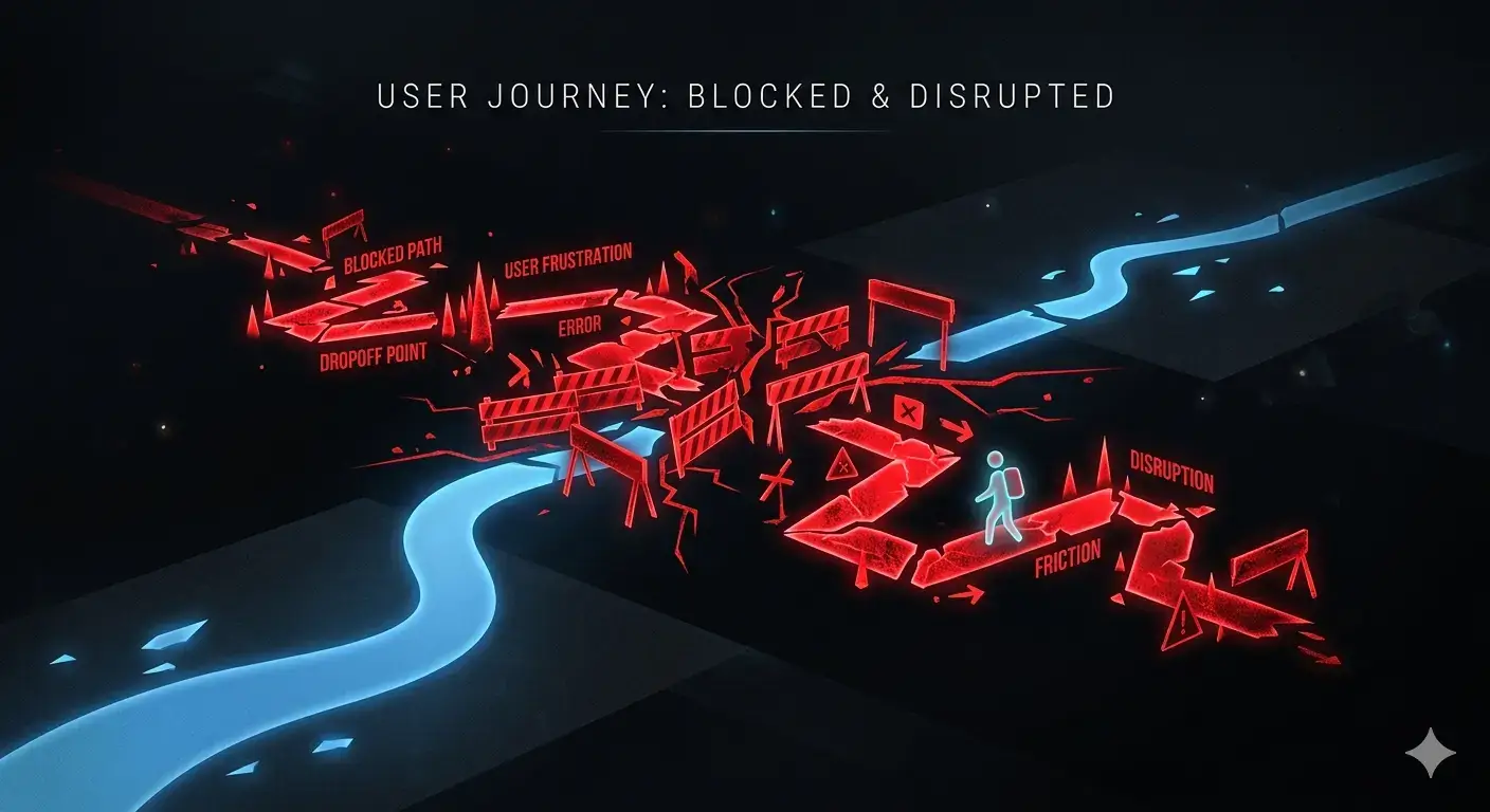
Start with evidence. Check where users stop, which devices expose layout issues, whether key forms submit correctly, and whether calls or messages reach the right team. A structured system review can connect visible UX symptoms with technical, tracking, and operational causes. A reduce friction UX review is more reliable than copying fashionable interface patterns.
A visitor should quickly understand what the business provides, who it helps, and what happens next. Pair a specific value proposition with one dominant action. Secondary links can support visitors who need more information, but they should not compete visually with the primary route. The Website Conversion System reflects this principle by treating message, proof, inquiry, and follow-up as connected layers.
Clarity also depends on sequence. Introduce the business problem before technical detail, explain the approach before requesting commitment, and position proof beside the claim it validates. Navigation labels should describe destinations in the reader’s language. On longer service pages, descriptive section headings and a consistent action give visitors orientation without forcing them to remember information from the top of the page.
Ask only for information required to begin a useful response. Explain why sensitive or unusual fields are needed, use clear labels, preserve entered data after an error, and show a meaningful confirmation state. These UX optimization strategies lower uncertainty while still giving the team enough context to qualify an inquiry. For appointment-led journeys, a structured booking and inquiry system can also reduce manual handoffs.
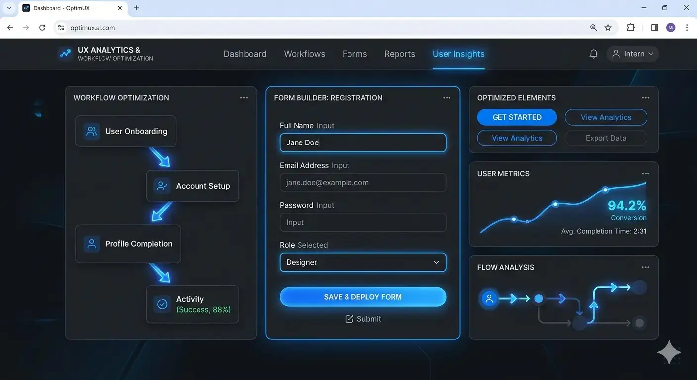
Performance and usability shape the same decision. A stable mobile layout, readable controls, predictable navigation, and responsive feedback help users continue confidently. Google’s guidance on Core Web Vitals provides a practical framework for loading, responsiveness, and visual stability. When implementation issues are broader, website repair and optimization can address slow pages, broken forms, mobile defects, and tracking gaps together.
Test the real task on an actual phone, not only a resized desktop window. Check sticky elements, keyboard behavior, tap targets, validation messages, consent controls, and the transition to external tools. Accessibility improvements such as visible focus, logical heading order, meaningful labels, and adequate contrast often make the interface easier for everyone because they remove ambiguity from interaction.
Trust should answer the doubt created by each step. Place relevant work, process details, useful FAQs, and clear contact information near the decision they support. Avoid decorative badges or claims that cannot be verified. Strong project evidence is more persuasive when it shows the problem, system, and outcome in context. Good conversion optimization tips strengthen comprehension rather than applying pressure.
Internal paths matter too. A visitor who is not ready to inquire may need a deeper explanation of website system architecture, a diagnosis of silent conversion leaks, or guidance on website performance optimization. Descriptive links let people resolve uncertainty without losing their place in the journey.
Random changes make it difficult to know what improved. Define the action that matters, confirm analytics and form events work, establish a baseline, and test one meaningful hypothesis at a time. Qualitative feedback explains why people hesitate; behavioral data shows where. Together they help increase conversion rate without confusing normal variation with progress.
Prioritization should balance user impact, business value, implementation risk, and confidence in the diagnosis. Fix broken journeys before polishing minor details. Document what changed and inspect lead quality as well as button clicks; a simpler form that creates unusable inquiries is not an improvement. When a change works, apply the underlying principle consistently across related templates rather than duplicating one visual treatment everywhere.
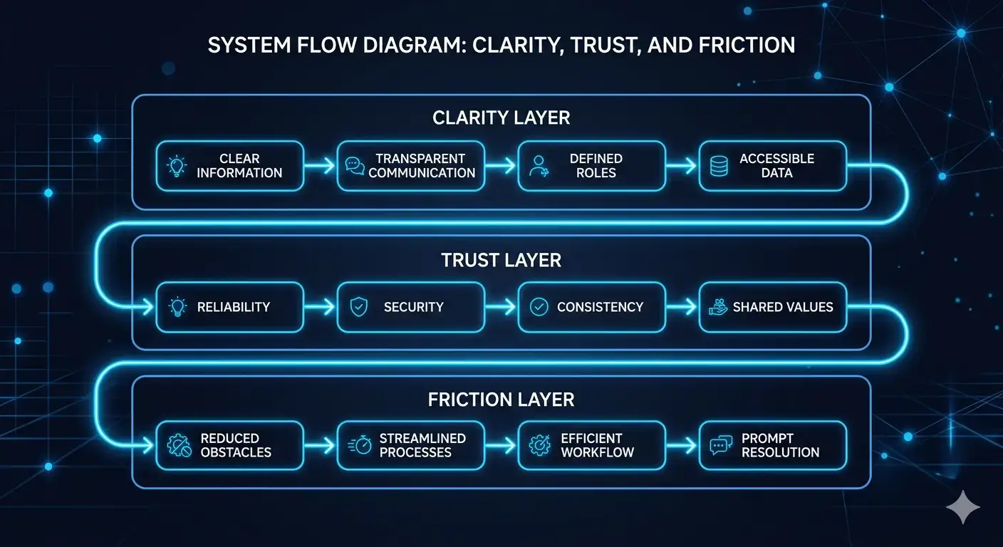
The final objective is not a collection of minor tweaks. It is a reliable path from attention to trust, action, response, and follow-up. Coordinating web development with measurement and operational handling helps improve website conversion beyond the visible interface. Apply conversion optimization tips as disciplined system improvements, then keep what measurably makes the journey clearer across the full journey.
Review the complete customer journey before investing in isolated redesign changes.
Start Your ReviewContact MonoArticle FAQ
Start with issues that block understanding or action: unclear positioning, competing calls to action, broken mobile layouts, slow interactions, and forms that fail or ask for unnecessary information.
Yes. Removing friction can help more existing visitors understand the offer and complete the intended action, although results should be measured against a reliable baseline.
Track the primary business action, verify supporting analytics and form events, compare changes over a meaningful period, and use qualitative feedback to understand why behavior changed.
Both affect continuity. If the layout shifts, controls are difficult to use, or feedback arrives slowly, visitors can lose confidence before completing the next step.
A redesign may be unnecessary when the core offer and platform remain sound and the main problems can be traced to specific messaging, navigation, form, performance, or tracking defects.