Necessary
Always activeSupports security, form reliability and remembering your privacy choice. It is not used for advertising.

High-converting pages coordinate clarity, trust, choice, performance, and follow-up so visitors can make confident decisions without pressure.
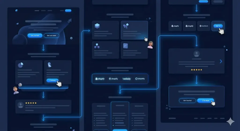
A conversion psychology website helps people make a confident decision without relying on pressure. Its pages clarify the offer, reduce uncertainty, and make the next step feel proportionate to the visitor’s intent. For business owners and marketing leaders, this changes the design question from “Does the page look impressive?” to “Can the right person understand, trust, and act on it?”
That shift matters because conversion rarely depends on one button. Message hierarchy, proof, navigation, performance, forms, and follow-up operate as one decision system. A useful website strategy planning therefore examines the complete journey rather than decorating isolated screens.
Visitors first need orientation: who the offer serves, what problem it solves, and where to go next. A cognitive load website problem appears when vague headings, competing messages, or inconsistent labels force people to interpret the interface. Clear section order and descriptive actions reduce that effort. Reviewing common website UX mistakes can reveal small structural choices that quietly interrupt comprehension.
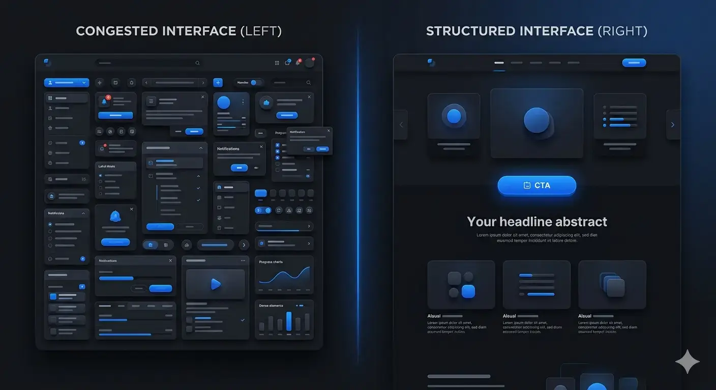
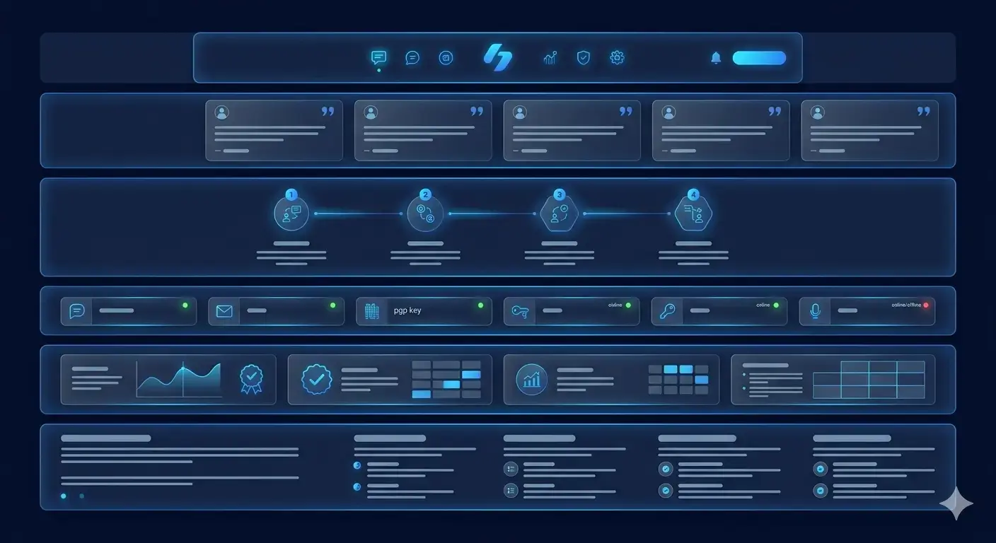
Professional styling can attract attention, but confidence comes from evidence and consistency. Relevant examples, transparent processes, specific service explanations, accessible business details, and realistic claims become website trust signals. They answer different forms of doubt at the moment each arises. These trust signal examples show why proof should sit within the journey, while trust-based website structure explains how multiple cues reinforce one another.
Placement matters as much as presence. A testimonial beside an unrelated claim creates little reassurance, and a process explanation hidden near the footer arrives too late. Match each concern with the evidence that resolves it: capability with relevant work, uncertainty with process, commitment with expectations, and legitimacy with clear company information. This produces confidence progressively instead of asking one generic proof section to carry the entire page.
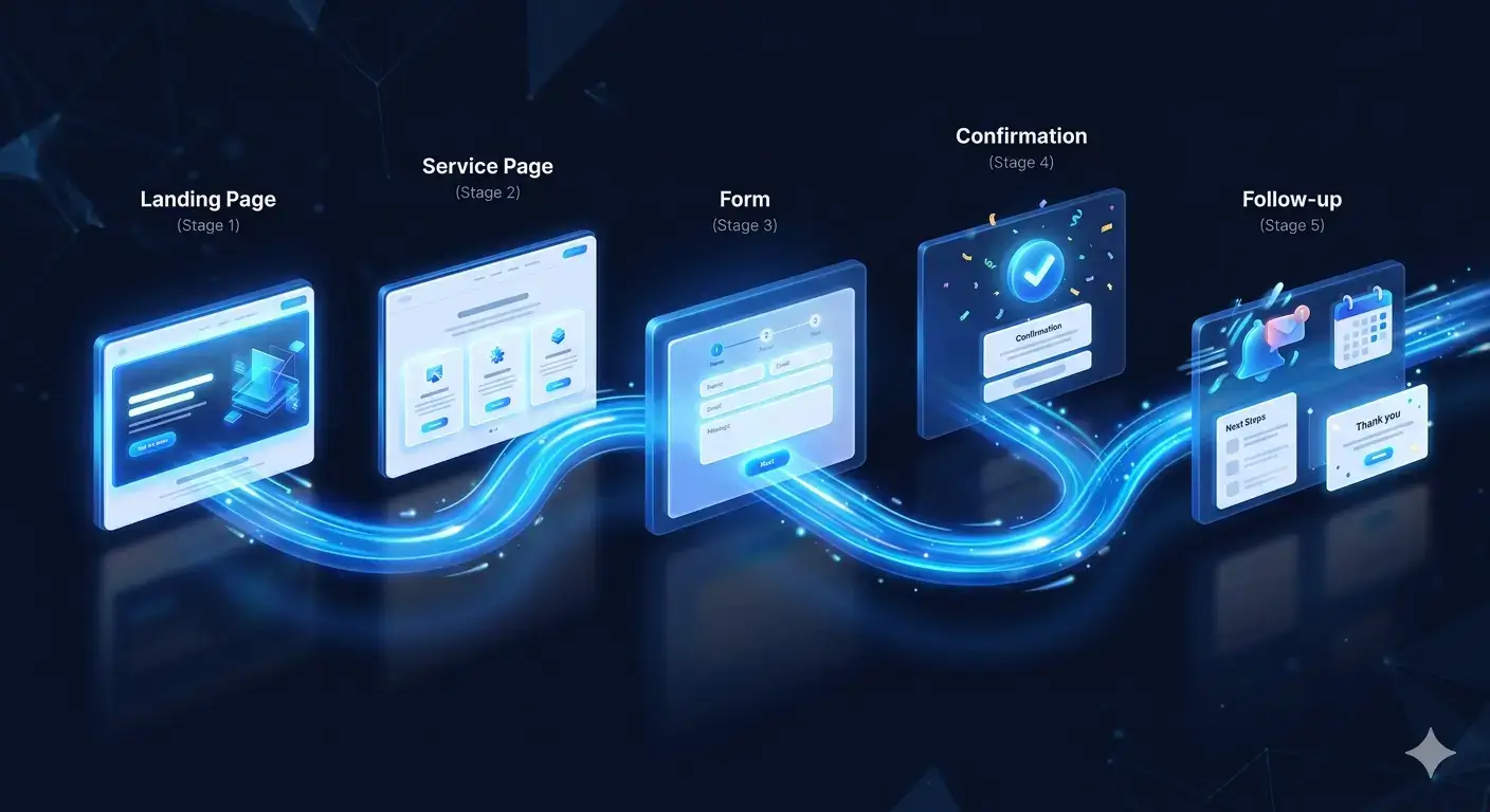
Good website conversion psychology anticipates the visitor’s next reasonable question. A coherent conversion flow moves from relevance to explanation, proof, evaluation, and action. Each section earns the next interaction. The Lead Generation System extends that logic beyond the page by connecting capture, routing, and response instead of treating submission as the finish line.
Every extra path creates a comparison. Navigation, service packaging, and CTA hierarchy should help users choose without hiding useful options. User decision friction grows when several buttons appear equally important or when labels describe actions poorly. This is a common reason websites receive traffic but not inquiries. A conversion psychology website establishes one primary action per decision stage and uses secondary paths only where they support a different level of readiness.
The right action should also reflect commitment. A reader exploring a complex service may need a diagnostic conversation, while someone comparing a defined offer may be ready for a structured request. Matching the CTA to that state avoids premature pressure. It also gives teams cleaner signals about intent, because each action has a specific purpose rather than functioning as a generic contact route.
Delays, layout shifts, and unreliable mobile interactions interrupt thought and weaken confidence. The connection between website speed and conversion is therefore behavioral as well as technical: performance determines whether the planned journey remains usable. The Core Web Vitals guidance from web.dev provides user-centered performance measures, while Mono’s guide to website performance optimization places those measures in a broader business context.
A form submission creates a new question: what happens now? Confirmation messages, response expectations, correct lead routing, and useful follow-up protect the confidence built on the page. This stage also shapes website user behavior; an unclear confirmation can make a qualified prospect submit again, switch channels, or assume the request failed. A structured conversion rate diagnosis should inspect this handoff alongside page content and forms.
Teams often change copy or colors before identifying the actual constraint. A better process maps user intent, reviews recordings or analytics where available, tests forms and mobile states, and checks whether proof appears before high-commitment actions. The benefits of a structured website audit come from connecting these observations rather than scoring pages in isolation.
Priorities should follow evidence and dependencies. Fix a broken form before rewriting its surrounding copy; establish reliable measurement before judging a new layout; and correct shared navigation before tuning individual pages. Document the intended path, the observed failure, the proposed change, and the verification method. This keeps optimization accountable and prevents several simultaneous edits from obscuring what actually improved the journey.
The strongest conversion psychology website is not a collection of persuasion tricks. It is a coordinated experience in which clarity lowers effort, proof reduces doubt, structure guides attention, speed preserves momentum, and operations complete the promise. When results disappoint, investigate the relationships between those layers. That approach exposes hidden conversion leaks and gives decision-makers a more defensible improvement priority than another surface-level redesign.
Review how messaging, proof, page structure, performance, forms, and response workflows support the complete journey from visit to inquiry.
Get a System ReviewContact MonoArticle FAQ
It is the use of clarity, proof, structure, choice, and feedback to help visitors understand an offer and decide whether to take the next step.
Visual polish cannot compensate for unclear positioning, weak proof, confusing paths, poor performance, or a broken handoff after form submission.
Use evidence that answers the visitor’s immediate concern, such as relevant work, a clear process, realistic claims, business details, and transparent response expectations.
Map the intended journey, review behavioral and analytics evidence where available, test key actions on real devices, and verify what happens after each inquiry.
Yes. Slow or unstable interactions interrupt attention, reduce confidence, and can prevent visitors from completing the journey the page was designed to support.