Necessary
Always activeSupports security, form reliability and remembering your privacy choice. It is not used for advertising.

A dependable design system aligns hierarchy, components, messages, proof, forms, and actions so visitors can understand and trust the complete journey.

Website design consistency is the operating logic that makes an interface predictable. Visitors should not have to reinterpret the meaning of a button, heading, card, form, or navigation pattern each time it appears. When those elements behave coherently, attention stays on the service and the decision. When they change without purpose, the interface creates questions the business never intended to ask.
Polish can hide this problem during an internal review because each section may look acceptable in isolation. The weakness becomes visible across a journey: the homepage establishes one visual language, a service page uses another, and the form introduces a third. Mono’s analysis of design and website trust explains why appearance cannot compensate for unpredictable behavior.
Inconsistent website design rarely fails through one dramatic mistake. It accumulates through competing button treatments, irregular spacing, shifting type scales, unrelated image styles, and different labels for the same action. Each change increases cognitive effort. The visitor may not identify the design fault, but reduced user confidence appears as hesitation, repeated scanning, abandoned forms, or quiet exits. These behaviors often sit behind broader website trust issues.

Consistency is not repetition for its own sake. A useful system defines what remains stable and where variation is appropriate. Typography establishes reading order; spacing separates ideas; color signals emphasis; and components communicate function. Strong visual hierarchy lets different sections serve different purposes while still feeling related. Mono’s guide to visual hierarchy and trust shows how attention order supports a decision.
Functional patterns need the same discipline. The W3C guidance on consistent identification explains that repeated functions should be identified consistently across pages. Clear labels, familiar controls, and dependable states strengthen UX consistency, including for people who rely on accessible names or learned interaction patterns. This is practical usability, not merely visual tidiness.
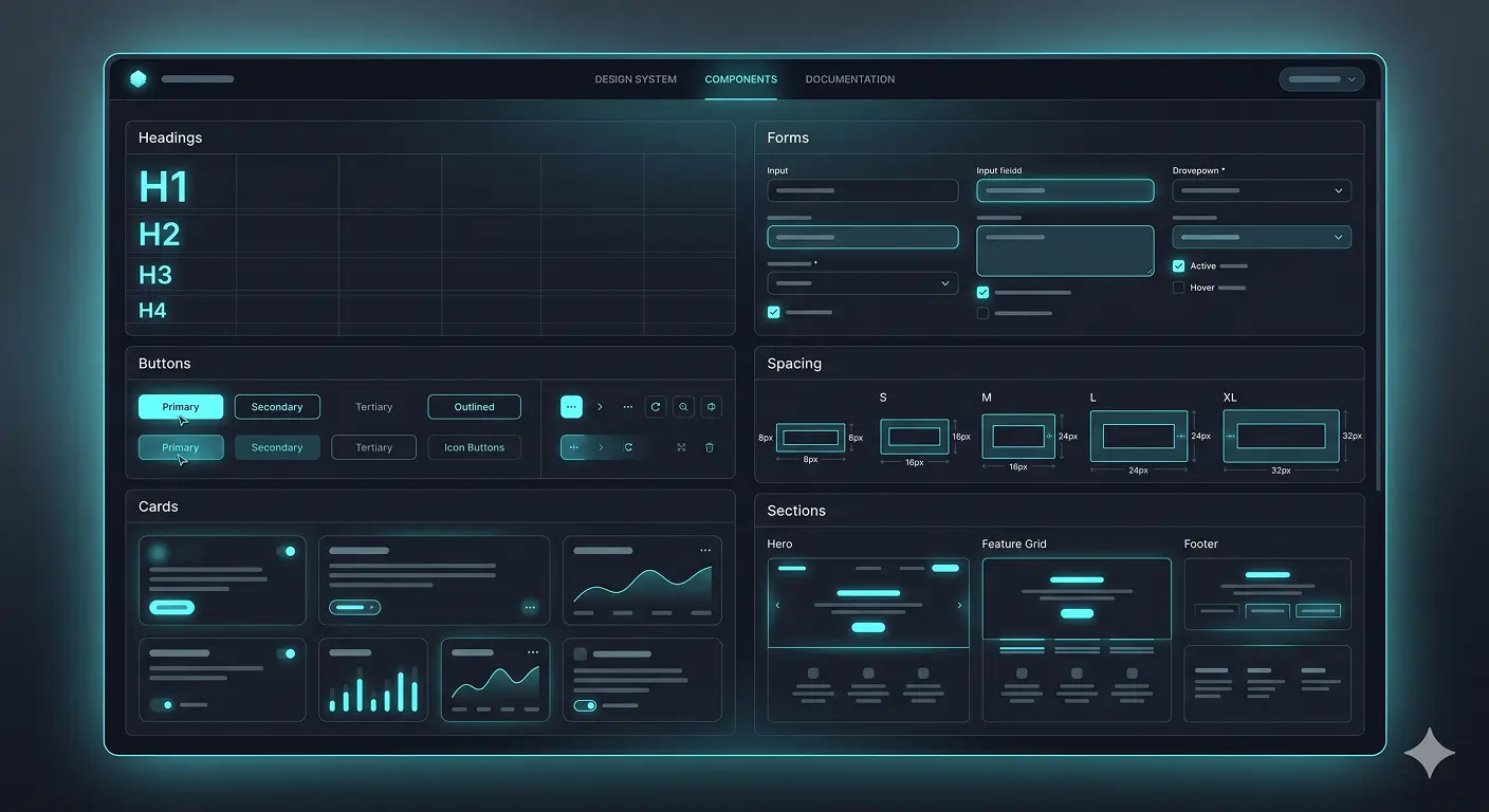
A component library becomes useful only when it records behavior as well as appearance. Teams need rules for hover, focus, disabled, validation, and responsive states, plus guidance on when each component should be used. Without that documentation, designers and developers make reasonable but different local decisions, and inconsistency returns as the website grows.
Brand consistency should extend beyond colors and logos. Tone, service terminology, proof, and CTA language must reinforce the same position. A website structure strategy helps teams coordinate those messages across pages instead of assembling unrelated sections around a shared header.
A coherent customer decision flow answers questions in sequence: what the service is, who it suits, why the business is credible, what evidence supports the promise, and what should happen next. Website credibility grows when the interface and content keep those answers aligned. Relevant website trust signals should appear beside the claim or action they support, not as an isolated strip added to every page.

Consistency is tested most sharply at the point of action. Field labels, validation messages, button priority, privacy context, confirmation copy, and mobile behavior should feel like part of the same experience. Focused form conversion optimization can reduce friction without removing information needed to handle the request. The promise made before the click should also match the response after submission.
This is where website trust signals become behavioral. A button leads to the expected destination; errors explain how to recover; completed forms confirm what happens next; and navigation preserves orientation. A reliable Website Conversion System coordinates message, trust, CTA, capture, and measurement instead of optimizing each element separately.
A practical review of website design consistency should inventory headings, buttons, cards, forms, spacing, colors, imagery, labels, interaction states, and repeated page structures. Then trace priority journeys across devices. Record where the same function changes identity, where emphasis competes, and where content contradicts the established position. This creates a repair list based on observed friction rather than aesthetic preference.
Ownership matters after the audit. Define who approves new components, updates shared patterns, checks accessibility, and reviews exceptions. A lightweight governance process prevents urgent campaign pages or plugin-generated screens from bypassing the system. It also gives content, design, development, and marketing teams one reference when requirements change.
The evidence should determine scope. A sound website redesign strategy preserves working assets and rebuilds only what the journey requires. Smaller problems may respond to targeted conversion and UX fixes. The broader website strategy framework helps connect these decisions to content ownership, technology, operations, and measurable outcomes.
Ultimately, website design consistency is a trust and decision system. It makes interfaces easier to learn, messages easier to believe, and actions easier to complete. The goal is not visual sameness. It is controlled variation built on dependable rules, so every page feels like part of the same capable business.
Review repeated patterns, priority journeys, forms, and trust signals before deciding whether targeted changes or a broader rebuild is justified.
Start a System ReviewExplore Website RepairArticle FAQ
A consistent website uses dependable rules for hierarchy, spacing, typography, components, labels, interaction states, messages, and repeated page structures while allowing purposeful variation.
Changing controls, labels, layouts, and visual priorities force visitors to reinterpret the interface. That extra effort creates uncertainty about what actions mean and what will happen next.
No. Pages can serve different purposes and use different arrangements. The underlying design language and functional behavior should remain predictable across the journey.
Start with headings, buttons, navigation, cards, forms, spacing, colors, image treatment, labels, feedback states, and the repeated structures used on priority customer journeys.
Not always. A focused component, content, or UX repair may be sufficient when the underlying structure is sound. Redesign scope should follow evidence from the complete journey.