Necessary
Always activeSupports security, form reliability and remembering your privacy choice. It is not used for advertising.

Trust begins with visual order: a clear sequence helps visitors understand the offer, find relevant proof, and choose the next action with less uncertainty.

A visual hierarchy website earns trust by making the next piece of information easy to find. Before visitors evaluate every claim, they scan the headline, supporting message, proof, and available action. If those elements compete, the page feels harder to understand. If they form a clear sequence, the business appears more considered and easier to deal with. This connection between structure and confidence is central to website conversion psychology.
Good hierarchy gives each section a job. The first screen establishes relevance; the next sections explain the offer; evidence answers risk; the call to action appears after enough context. This attention flow prevents visitors from assembling the story themselves. It also lowers cognitive load, because fewer choices and visual signals must be interpreted at once.
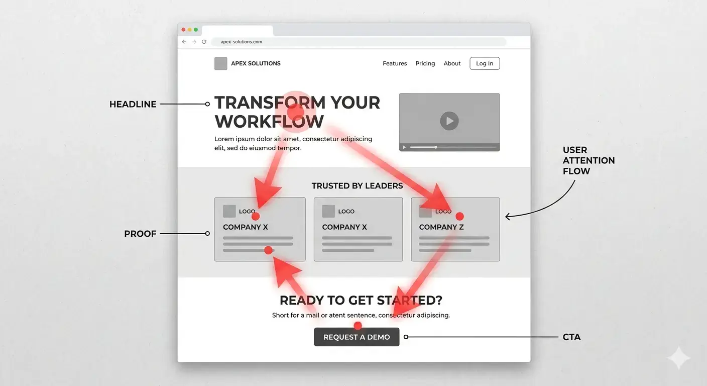
The dominant headline should tell the right visitor what the page offers and why it matters. A clever phrase that hides the service forces interpretation. Pair the headline with concise supporting copy, then make the primary action visually distinct. This is a practical application of visual hierarchy in web design, not a reason to enlarge every element. Clear priorities also avoid common conversion optimization mistakes caused by vague messages and competing actions.
Size should express importance, while typography should reveal levels of meaning. One page title, descriptive section headings, readable body text, and restrained labels create a dependable reading pattern. When everything is large or bold, emphasis disappears. Establish these rules during website strategy planning so design decisions follow the customer journey rather than personal preference.
Whitespace groups related content and signals when a new thought begins. Tight spacing can make unrelated elements appear connected; excessive spacing can break a useful sequence. Consistent section padding, paragraph width, and proximity between labels and controls make the page calmer. These details prevent the small UX mistakes that disrupt conversion.
Responsive layouts need the same discipline. Columns that feel balanced on desktop may stack into a confusing mobile order, leaving a heading separated from its proof or a secondary button above the main action. Review the reading sequence at common breakpoints, not only the component styling. The relationship between elements must survive the change in screen width.
Testimonials, project evidence, process explanations, contact details, and clear policies are useful website trust signals only when visitors notice them at the relevant moment. Proof about delivery belongs near service claims; reassurance about privacy or next steps belongs near a form. A visual hierarchy website should not hide evidence in a distant carousel or footer. Review these examples of trust signal placement when deciding what supports each claim.
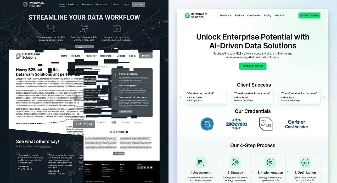
Color and contrast can identify the primary action, but too many accent colors create false priorities. Use one dominant action style and quieter treatments for secondary choices. Contrast must also protect readability: the W3C explains why adequate text contrast matters for people with reduced contrast sensitivity. Accessibility and hierarchy work together when emphasis remains readable rather than decorative.
Interaction states need a clear order as well. Hover, focus, error, success, and disabled styles should communicate what changed without introducing a new visual language. A form that suddenly uses unfamiliar colors or moves its instructions after an error creates doubt at the point of highest intent. Consistent feedback keeps the visitor oriented through completion.
The visual hierarchy of an effective landing page should reflect the visitor’s intent from the source campaign or search query. Keep the promise consistent, answer likely objections in order, and avoid equal-weight exits that interrupt progress. A conversion-focused website still gives people freedom, but it does not make them compare unrelated routes. The wider website system architecture should preserve that logic from page entry through form submission and response.
A button color test cannot repair a page whose message, proof, and action are in the wrong order. Review mobile and desktop layouts, then trace what a new visitor notices first, second, and third. A structured conversion rate diagnosis can connect observed hesitation to specific sections. A broader website audit can identify whether navigation, performance, content, or technical behavior compounds the problem.

Hierarchy is effective when it helps qualified visitors understand, evaluate, and act without unnecessary effort. Start with the business decision the page must support, map the questions that precede it, and assign visual weight accordingly. Then measure progression through meaningful actions rather than judging the page by appearance alone.
A strong visual hierarchy website does not need constant visual novelty. It needs consistent priorities across templates, devices, and customer-journey stages. When message, proof, action, and operational follow-up work as one path, the page becomes easier to trust and easier to improve. Mono’s Website Conversion System applies that connected view to clarity, trust, capture, and measurement.
Review how your page orders its message, evidence, calls to action, and lead path before replacing useful content or design assets.
Request a System ReviewView Web DevelopmentArticle FAQ
Visual hierarchy is the order in which a page directs attention. It uses scale, spacing, typography, contrast, grouping, and placement to show what matters first and what action follows.
Clear hierarchy reduces uncertainty. Visitors can identify the offer, supporting evidence, and next step without decoding the page, which makes the experience feel more dependable.
The page's main promise and primary action should usually lead. Proof, explanatory content, and secondary routes should receive enough emphasis to support the decision without competing with it.
Yes. Reordering sections, clarifying headings, reducing competing actions, improving spacing, and moving proof closer to moments of doubt can improve the decision path while preserving useful assets.
Check the sequence after responsive stacking, confirm that headings and buttons retain clear priority, and verify that proof remains near the claim or form it supports.