Necessary
Always activeSupports security, form reliability and remembering your privacy choice. It is not used for advertising.

A polished interface can still make simple decisions difficult. Test the real customer journey to uncover the hesitation, confusion and broken interaction states that quietly reduce trust and inquiries.
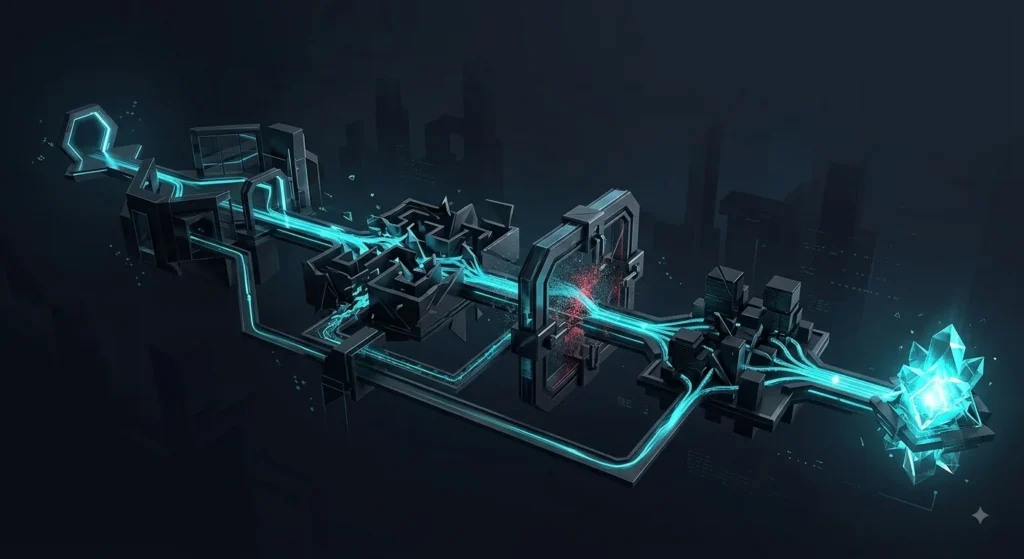
A website can be visually polished and still make simple actions unnecessarily difficult. That is why website usability testing should focus on what real visitors can understand, locate and complete—not whether a team likes the design.
For service businesses, small usability failures rarely stay isolated. A vague headline delays understanding. A hidden proof point weakens trust. A confusing form interrupts lead capture. When several of these problems appear in one journey, the website creates UX friction before the visitor ever reaches a conversion point.
The most useful tests are built around realistic intentions: understand a service, compare options, find proof, submit an inquiry or recover from an error. Moderated usability testing is especially useful because you can watch participants attempt specific tasks and hear where they become uncertain, a method also described in GOV.UK’s usability-testing guidance.
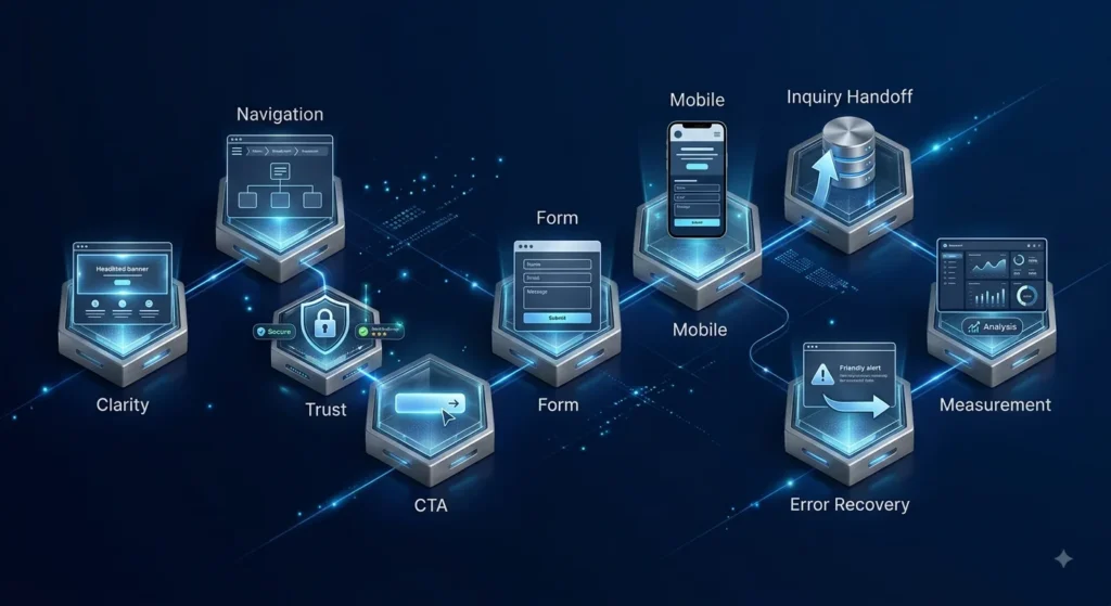
Show the page briefly, then ask what the company does, who it helps and what the visitor should do next. If answers vary widely, the problem is usually message hierarchy rather than visual style. Compare the result with the principles behind a clear visual hierarchy.
Give users a goal without naming the menu item. Ask them to find the relevant service, solution or next step. Watch for hesitation, backtracking and repeated menu opening. Navigation should reflect the user journey, not the company’s internal structure.
Ask participants what evidence they would need before contacting the business, then see whether they can find it. Reviews, work, process details and clear business information should appear close enough to important claims to reduce uncertainty. Strong website trust signals work as part of the decision path, not as decoration.
At key sections, ask users what they expect each button to do before clicking it. If labels such as “Learn More” or “Get Started” could lead almost anywhere, the interface is asking visitors to guess. The Website Conversion System treats CTA placement and action matching as part of the conversion path.
Complete the form on desktop and mobile using realistic data. Check field labels, required states, validation messages, keyboard behavior, confirmation and what happens after submission. W3C guidance on accessible forms is useful here because clear labels and instructions support people in completing inputs correctly.
Do not assume a responsive layout is a usable mobile experience. Test tap targets, sticky elements, scrolling, content order, menus, forms and keyboard states on a real device. Technical speed matters too, but a fast page can still create friction; the PageSpeed optimization guide explains why performance and journey quality should be reviewed together.

Usability does not end when the form submits. Verify the thank-you state, confirmation message, contact expectations and route into the business. A real project such as the HGNS law-firm redesign shows why the consultation path matters as much as the page presenting the service.
Use incorrect form data, broken assumptions and alternate routes. Can users understand what went wrong and recover without starting over? Error handling is part of trust. A smooth happy path can hide serious conversion friction until a real visitor encounters an edge case.
Pair session notes, task completion and analytics: CTA clicks, form starts, form completions, device differences and meaningful inquiry events. A repeatable website usability testing process should compare observed problems with behavioral signals instead of treating either source as complete. The goal is not to turn a small test into a statistical claim. It is to decide what deserves priority. That connection between behavior and business outcomes is central to website revenue optimization.

Website usability testing becomes valuable when findings lead to decisions. Group issues by severity, frequency, journey stage and business consequence. Fix blockers first, then reduce hesitation, then improve polish.
A System Review can connect those findings with message clarity, trust, mobile behavior, forms, measurement and operational handoff. The result should not be “redesign everything.” It should be a smaller, evidence-based list of changes that makes the customer journey easier to understand, trust and complete.
A usability problem does not automatically require a redesign. Review the journey, forms, mobile behavior, trust and measurement first—then prioritize the smallest changes that remove the real blockers.
Get System ReviewDiscuss the WebsiteArticle FAQ
The purpose is to identify where real users struggle to understand, navigate or complete important tasks. It helps replace internal assumptions with observable evidence about the customer journey.
Common signals include navigation hesitation, unclear calls to action, abandoned forms, repeated backtracking, mobile interaction problems and users misunderstanding what happens after an action.
Usually, yes. Testing the existing journey can reveal which problems actually need structural change and which can be solved through smaller improvements to messaging, hierarchy, forms or interaction design.
No. Accessibility testing evaluates whether people with disabilities can effectively perceive and interact with the website against accessibility requirements. Usability testing observes how successfully target users complete real tasks. They overlap, but neither replaces the other.
Track signals connected to the affected journey, such as CTA interaction, form starts and completions, device differences, successful submissions and meaningful inquiry events. Compare those signals with observed user behavior rather than relying on one metric alone.