Necessary
Always activeSupports security, form reliability and remembering your privacy choice. It is not used for advertising.

A landing page converts when traffic intent, message, proof, action, lead capture, and follow-up work as one decision system.
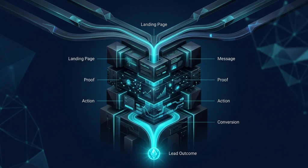
A landing page should do one job: move the right visitor from interest to a clear next action. A high converting landing page is not simply attractive or concise. It aligns the promise that brought the visitor in with the information, proof, interaction, and lead path they need to make a decision.
Mono’s broader view of website revenue optimization treats conversion as a connected system rather than a collection of page sections.
Strong landing page conversion starts before the visitor arrives. The page should continue the intent created by an ad, search result, email, referral, or campaign. Google Ads guidance on landing pages also recommends close alignment between ads, keywords, and landing pages.
Good message match removes the gap between what created the click and what the visitor sees after arriving.
The hero should answer three questions quickly: what is being offered, who it is for, and what the visitor should do next.
Use conversion-focused copy: a precise headline, short supporting statement, and visible action create orientation. Mono’s guide to visual hierarchy and conversion shows why attention order matters before visitors engage deeply with content.
A focused landing page should not ask visitors to choose between six unrelated destinations. Define one primary business action: request a review, book a consultation, start a quote, register, or submit an inquiry.
Secondary actions can support lower-intent visitors, but CTA placement should reinforce the same journey.
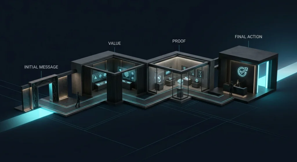
A high converting landing page should answer questions in the order they naturally appear: relevance, value, credibility, process, risk, and action.
Good structure reduces decision effort. The Website Conversion System uses the same principle: message, trust, CTA, capture, handoff, and measurement should work as one path.
Features describe what exists. Value explains why it matters in the visitor’s situation.
For a service business, “CRM integration” is a feature. “Route every qualified inquiry into the right follow-up process” explains operational value. The better landing page connects capabilities to decisions, workflow, risk, speed, or revenue impact.
Testimonials, relevant work, process detail, qualifications, guarantees, and clear expectations can all act as trust signals. Their placement matters.
Proof should appear close to the claim it supports, not isolated near the footer. Mono’s analysis of conversion leaks on business websites explains how gaps across entry, trust, action, and conversion stages weaken the journey.
A lead capture form should collect enough information to support the next business step without demanding unnecessary effort.
Use clear labels, sensible field types, obvious required states, and a logical sequence. web.dev guidance on form design recommends visible labels and straightforward form structures that make required information easier to understand.
For higher-consideration services, qualification can improve lead quality, but every field should earn its place.

Buttons such as “Submit” or “Learn More” often hide what happens next. Strong CTA language names the action or expected outcome: “Request System Review,” “Get a Quote,” or “Book Consultation.”
W3C guidance on link purpose similarly emphasizes wording and context that help users understand where a link or action will take them.
Landing page UX should remain clear when space is limited. Headlines must wrap cleanly, proof should not disappear below oversized media, buttons need comfortable tap targets, and forms should not become visually heavy.
Technical speed also matters, but Mono’s PageSpeed optimization guide explains why loading performance must support the broader customer journey.
Not every landing page needs the full website navigation. Campaign-specific pages often benefit from fewer escape routes when the visitor already has a clear context.
The goal is not to trap users. It is to remove irrelevant choices while preserving trust, accessibility, and necessary information. This is one reason landing pages should be designed as intentional parts of website system architecture, not isolated templates.
A high converting landing page does not end at the form submission. Confirmation, routing, notification, qualification, CRM capture, and follow-up determine whether the lead becomes operationally useful.
Mono’s Digital Marketing service explicitly connects landing pages, forms, tracking, and follow-up rather than treating the click as the finish line.
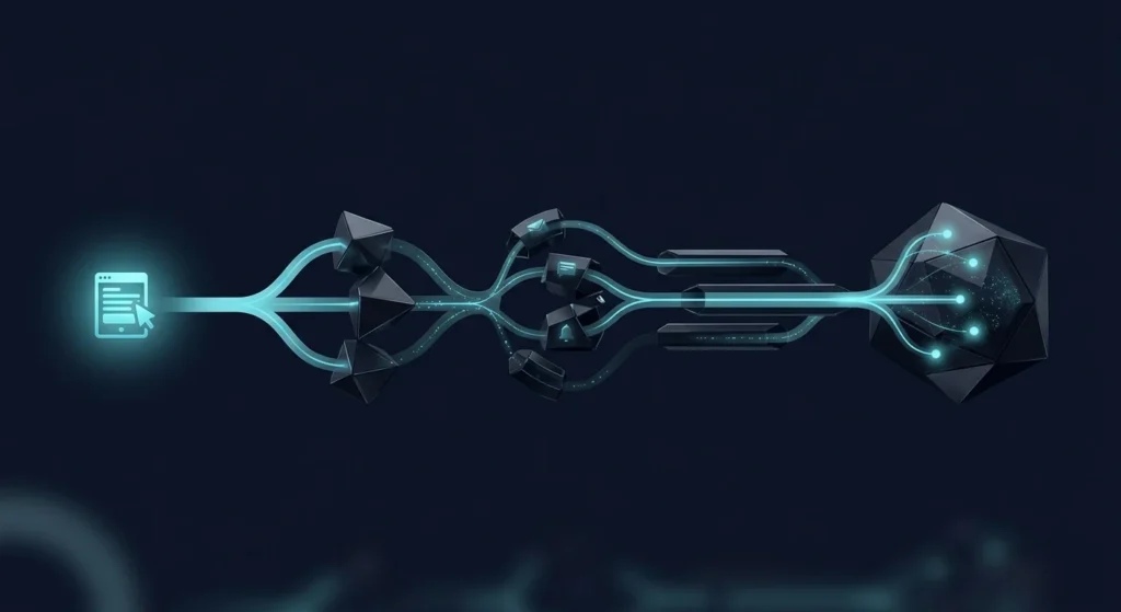
Measure more than page views. Track meaningful actions such as CTA clicks, form starts, completed submissions, thank-you states, source quality, and downstream handling.
If traffic is healthy but inquiries remain weak, use a structured website audit to identify where the decision path breaks. The best high converting landing page is not the one with the most persuasive elements. It is the one where message, proof, action, capture, and follow-up work together with the least unnecessary friction.
If the right visitors already reach your website but the journey from message to trust, inquiry, and follow-up is unclear, review the conversion system before adding more traffic.
Explore Conversion SystemGet System ReviewArticle FAQ
A landing page should guide a specific audience toward a defined action. Its message, proof, CTA, form, and next step should support that single decision rather than compete for attention.
Not always. A focused campaign page may benefit from limited navigation when unrelated options distract from the intended action. Essential trust, accessibility, and business information should still remain available.
There is no universal ideal number. Ask for the information genuinely required to qualify or process the inquiry, and remove fields that do not support the next business step. W3C guidance similarly recommends requesting only information required for the process.
Useful measurements can include CTA interaction, form starts, completed submissions, thank-you states, traffic source, and what happens to the lead after capture. The relevant events should reflect the actual business journey.
Yes. Visual quality cannot compensate for weak message alignment, hidden proof, unclear actions, excessive form friction, or a disconnected follow-up process.